By My Eyes
Adding a feature to a mobile application, Be My Eyes
ROLE
UX Designer
DURATION
2 weeks
TOOLS
Figma + Miro
TEAM
Deepika Mohanty
Liniris Rodriguez
Tomomi Tsukioka
OVERVIEW
The mobile application Be My Eyes is a free application that connects blind and low-vision people with sighted volunteers for visual assistance through a live video call.
Be My Eyes users can request assistance in over 180 languages making the app the biggest online community for blind and low-vision people as well as one of the largest micro-volunteering platforms in the world.
As a blind or visually impaired user, Users could seek help through the app by getting connected to a volunteer who has signed up to be of help. Even if it’s for a few short seconds, to the blind and visually impaired person, that could be everything.
DISCOVER
ELEMENT ANALYSIS
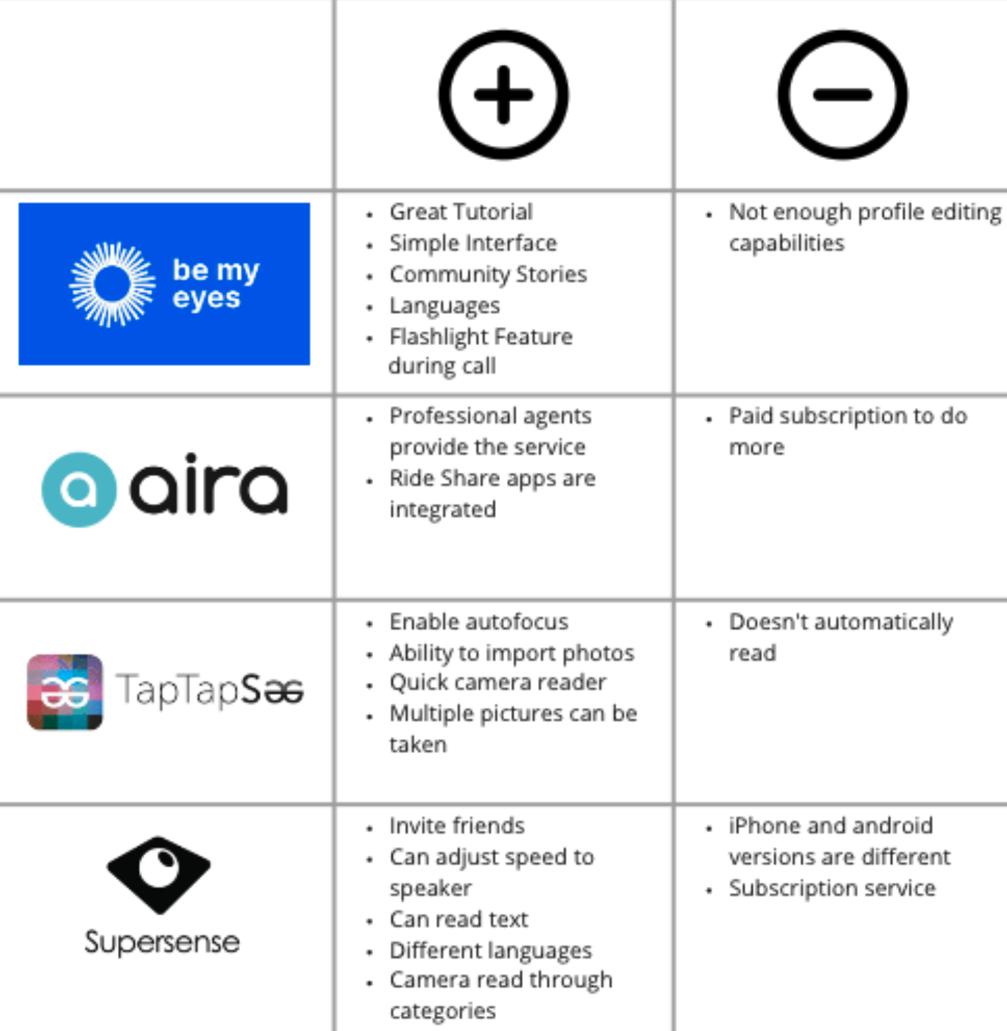
We conducted our competitive analysis with three other apps that were similar to Be My Eyes: Aira, TapTapSee, and Supersense.
We learned that all apps use the camera function in order to help the visually impaired user.
We also learned that there is no way to add friends to the app

PLUSES + DELTAS
For our pluses and deltas, we looked at each app and their features to see what worked or could be improved.
Here, we learned the simplicity of the interface compared to the other apps. Also, be my eyes users have access to many language options
DEFINE
USER INTERVIEW
4 interviews with visually impaired users
5 interviews with sighted users
Questions for visually impaired users consisted of how they navigate through their phones and asking for help when needed, with or without the app and what feature in phone and app stood out for them.
Questions for sighted users consisted of ways they set their engagements and correspond to other people about them. Also about what features are used to do so.
Through our affinity mapping, we discovered that:
Many of the visually impaired users are often nervous to show personal items or spaces to a complete stranger.
They do wish that someone on the other side of the call was someone they could trust, like a friend.
Showing personal items, like their medicine label or their homes, is a scary thing for the visually impaired users.
Many sighted volunteers felt extremely awful for being unavailable when they knew the person on the other line needed help.
Volunteers wish there were easy ways to help communities.

PRIMARY PERSONA: MARK
As a result of our research, we created our primary persona. Mark is a young professional who happens to be visually impaired. He’s pretty independent when it comes to navigating around his community, however, there are moments he requires further assistance with some tasks, such as reading documents, etc. He currently connects with volunteers via the app “Be My Eyes”, who help with these tasks. Sometimes he wishes he could be reconnected with helpful volunteers that make him feel less anxious about receiving assistance.

Goals + Needs
A platform that allows visually impaired users to stay connected with helpful volunteers
A platform that provides access to a form of self-help
The ability to contact people from their list
Pain Points
Mark doesn’t like rotating through several volunteers every time he calls in
Mark feels some anxiety with the idea of being a bother to volunteers
There isn’t a way to reconnect with volunteers
SECONDARY PERSONA: TIA
Tia is a software professional, who uses the app “Be My Eyes” so they can help the blind and visually impaired community globally. Although excited, oftentimes, she finds it hard to decline calls from “By My Eyes” but picks up even when they are actually unavailable at the moment. Because of this, they tend to rush off the call making the person on the other end feel like nuance. They wish there was a way to communicate their unavailability so no one feels like a bother.

Goals + Needs
A place to set availability times
A choice-based decision, for answering the calls
Needs to turn off and edit availability
Pain Points
Feels frustrated when she cannot answer calls
Feels bad when she is too busy to answer calls
PROBLEM STATEMENT
Users need a way to gain trust with the volunteers so they feel less anxious when asking for on-demand, volunteer support.
DESIGN
ADDED FEATURE
From user research and competitive analysis, we learned that it was important that the users feel more comfortable while speaking with each other. Thus, we decided that there had to be two user flows: one for the volunteer users and one for the blind and visually impaired user.
For volunteer side: we added a feature for users to be able to set availability in their app.
For the visually impaired side: we added a way for them to add volunteers they enjoyed talking to to their preference list.
With these two functions added, both side of the users will feel more comfortable when being connected via the live camera function.
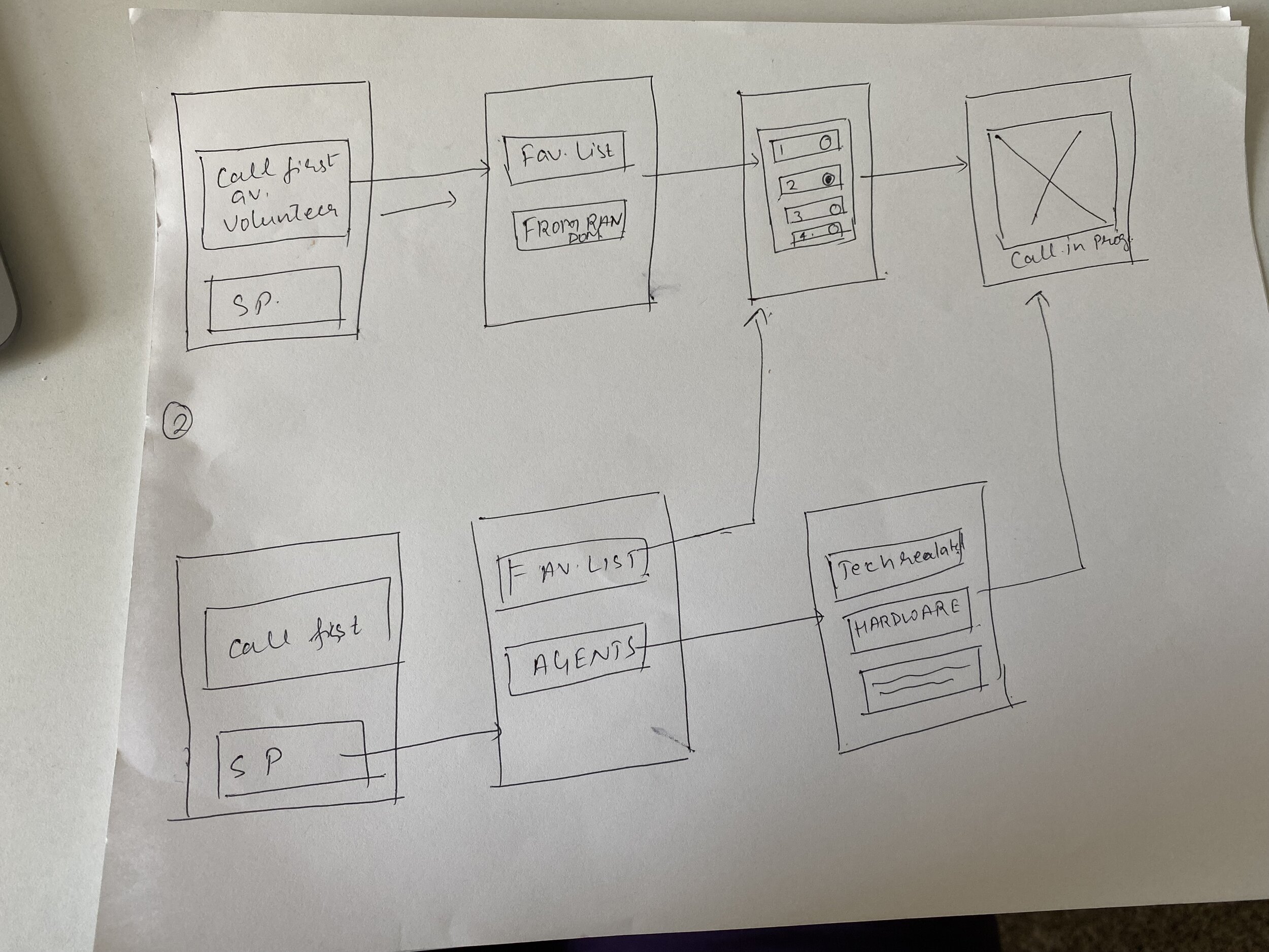
USER FLOW: VOLUNTEER
USER FLOW: VISUALLY IMPAIRED
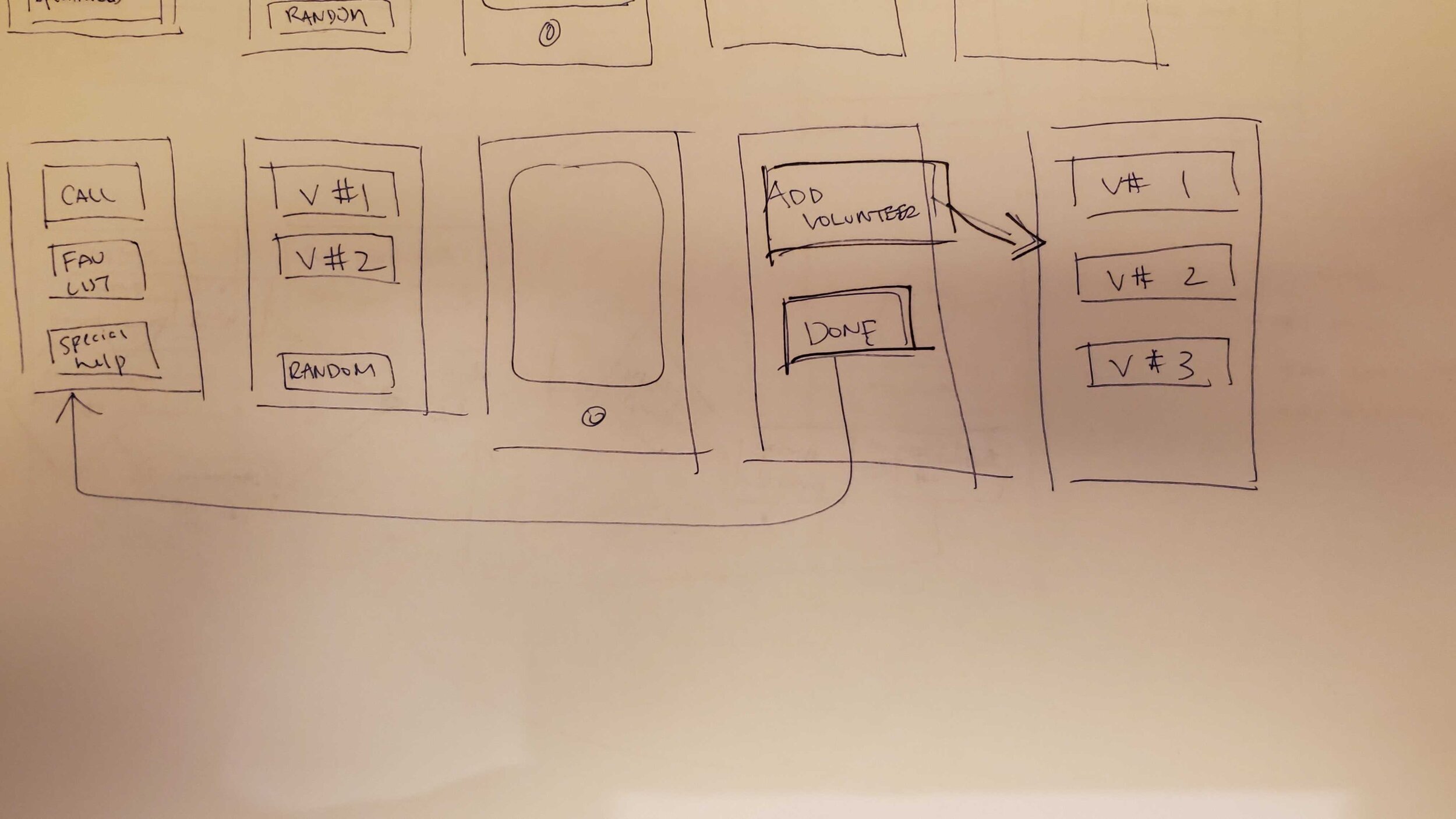
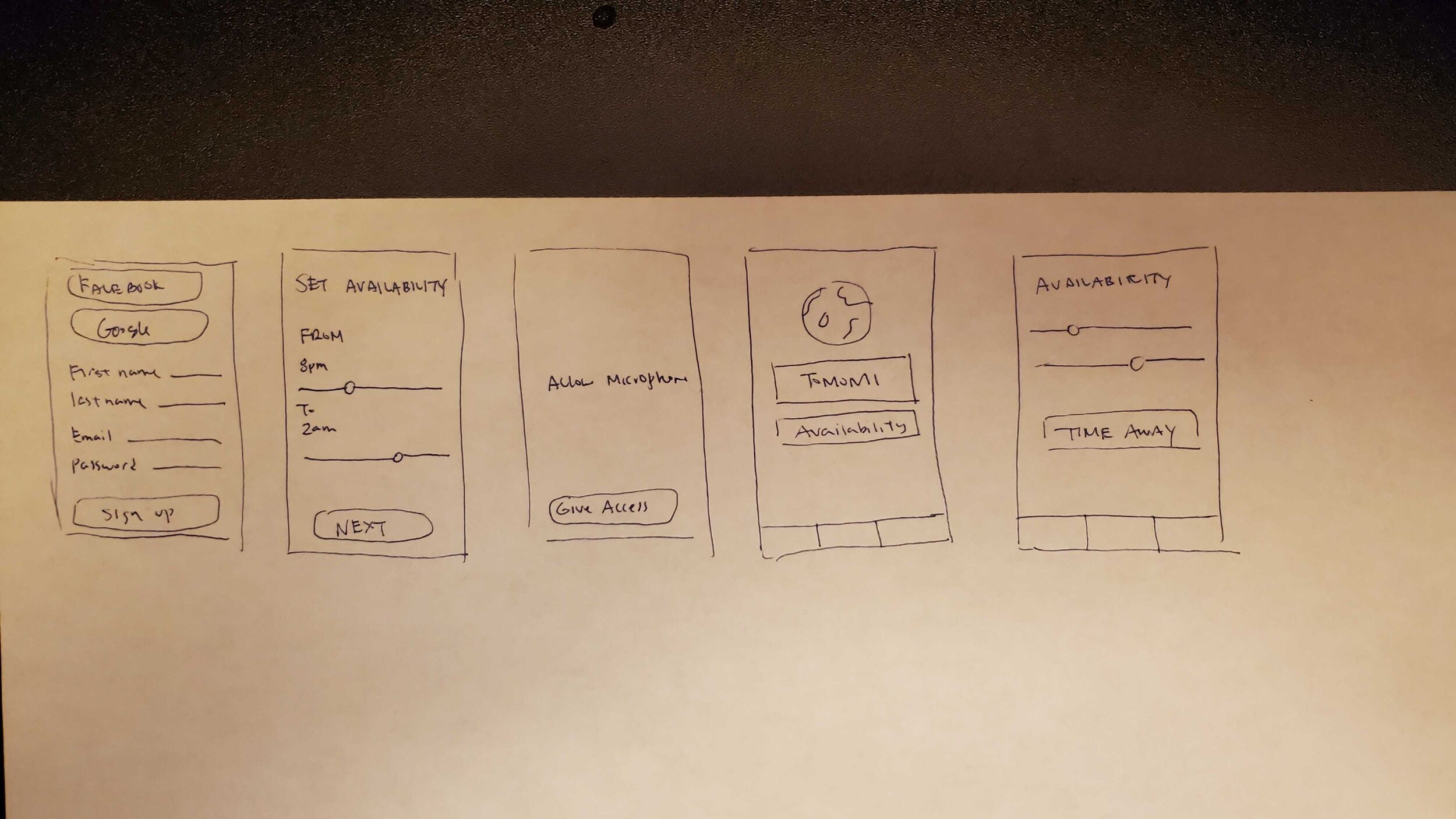
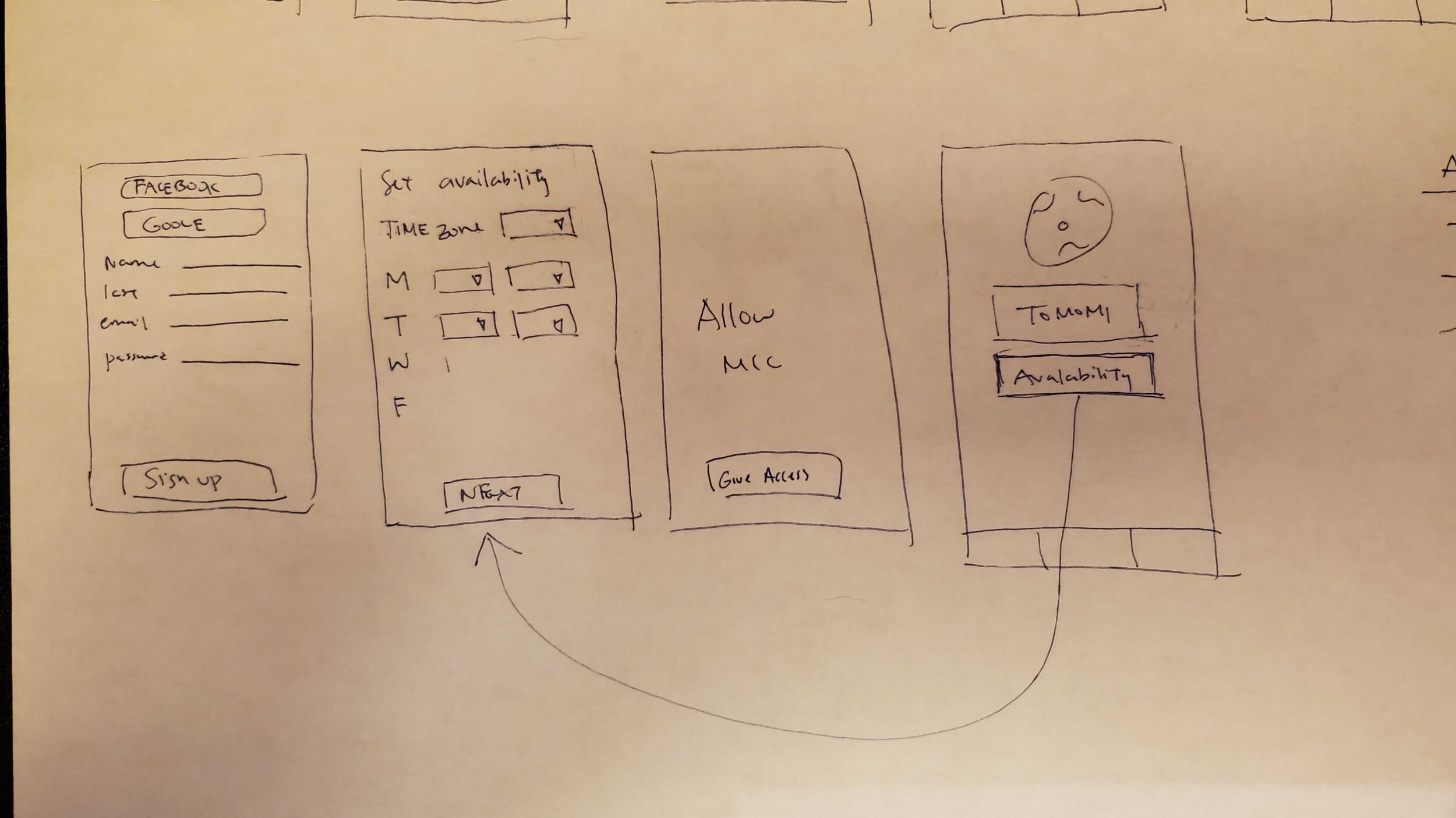
WIREFRAME: VOLUNTEER
We sketched out the best possible way for the user to add and change availability. At the same time, we wanted to maintain the existing UI's simplicity.
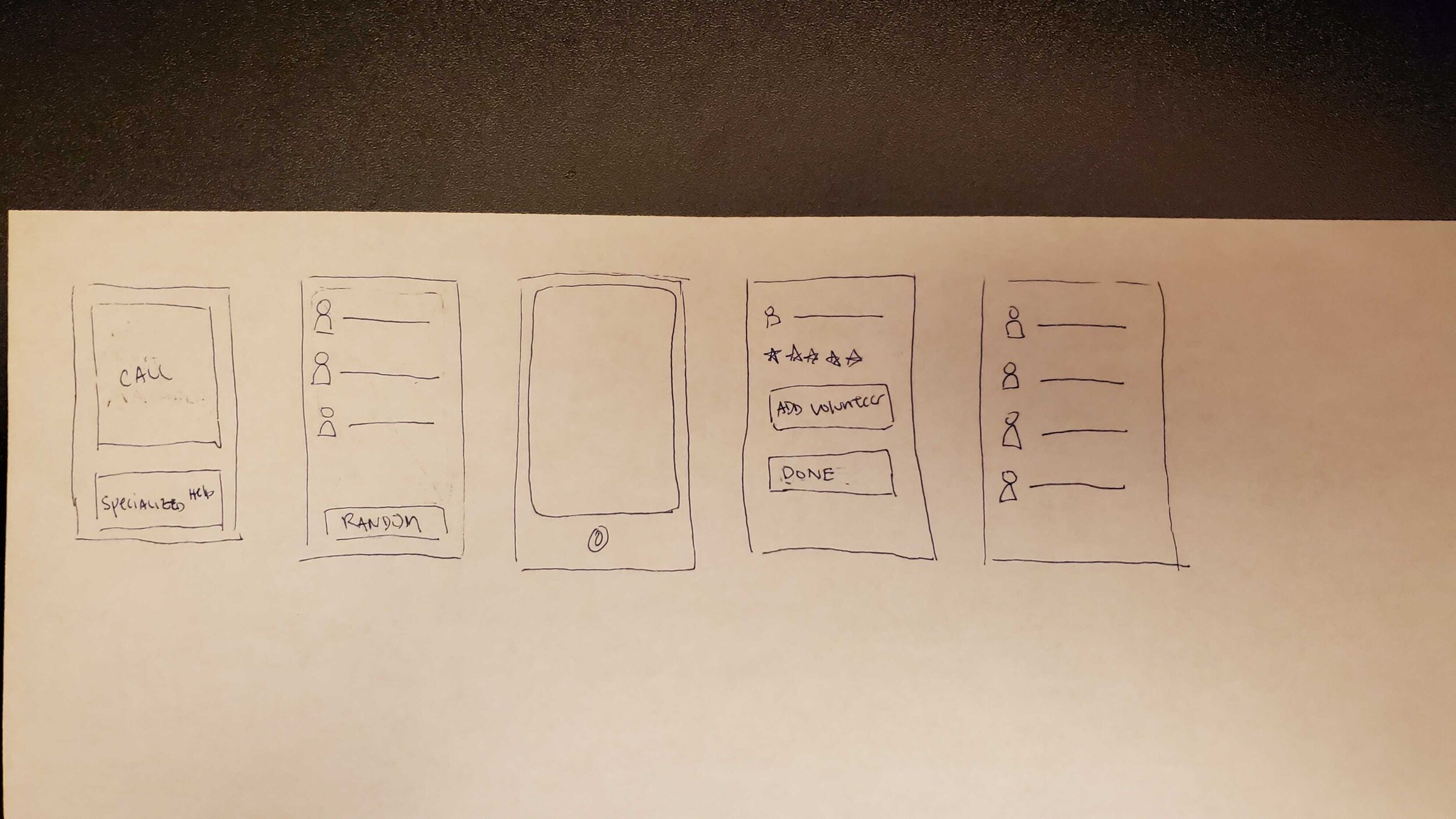
WIREFRAME: VISUALLY IMPAIRED
We sketched out ways to make the buttons and text legible for the wireframes. When we spoke with the app's CCO, Alexander, he explained that the high contrast of blue and white was great for accessibility. Additionally, the colors can be easily inverted for those who wish to do so via iOS or Android settings.
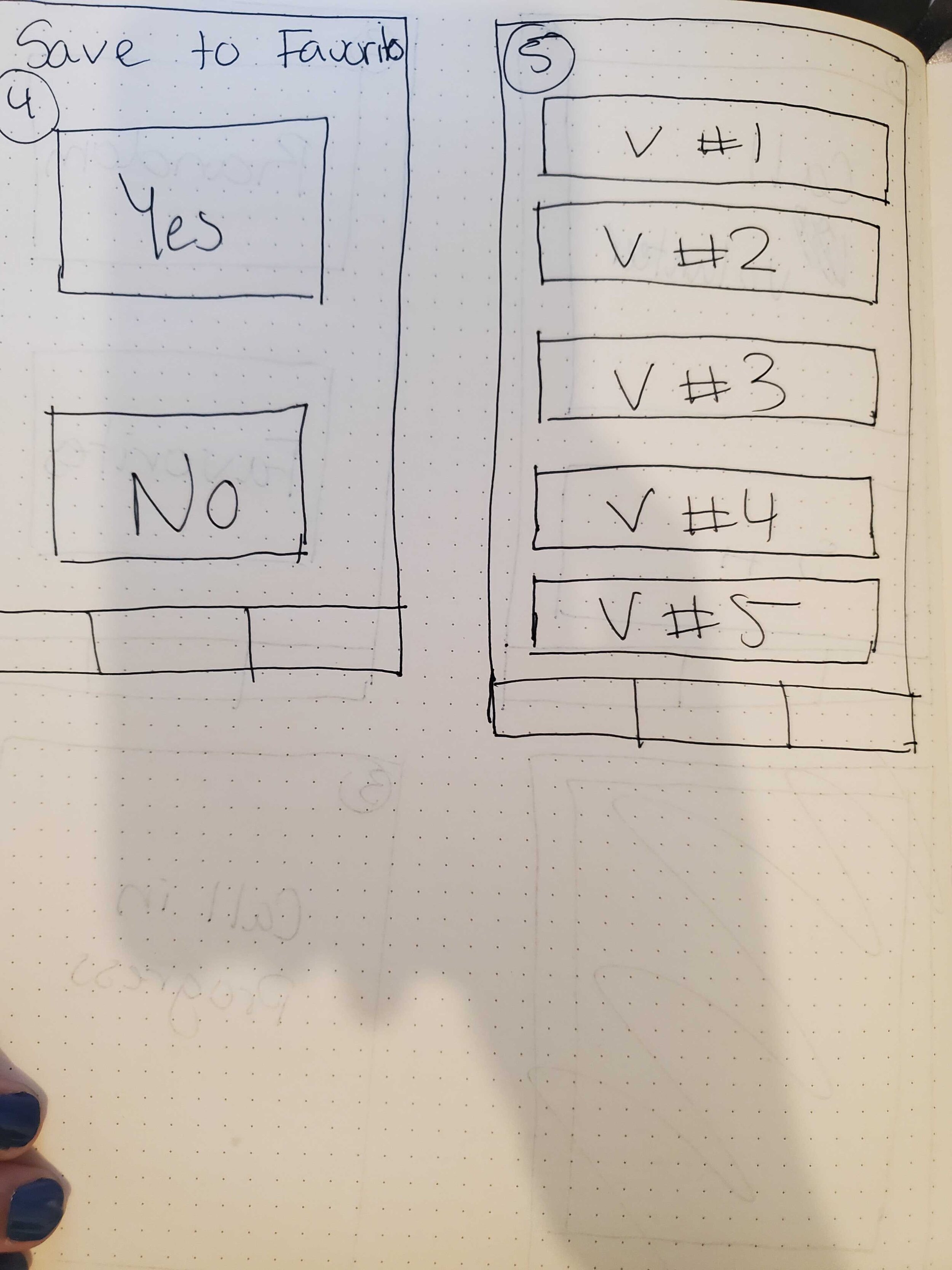
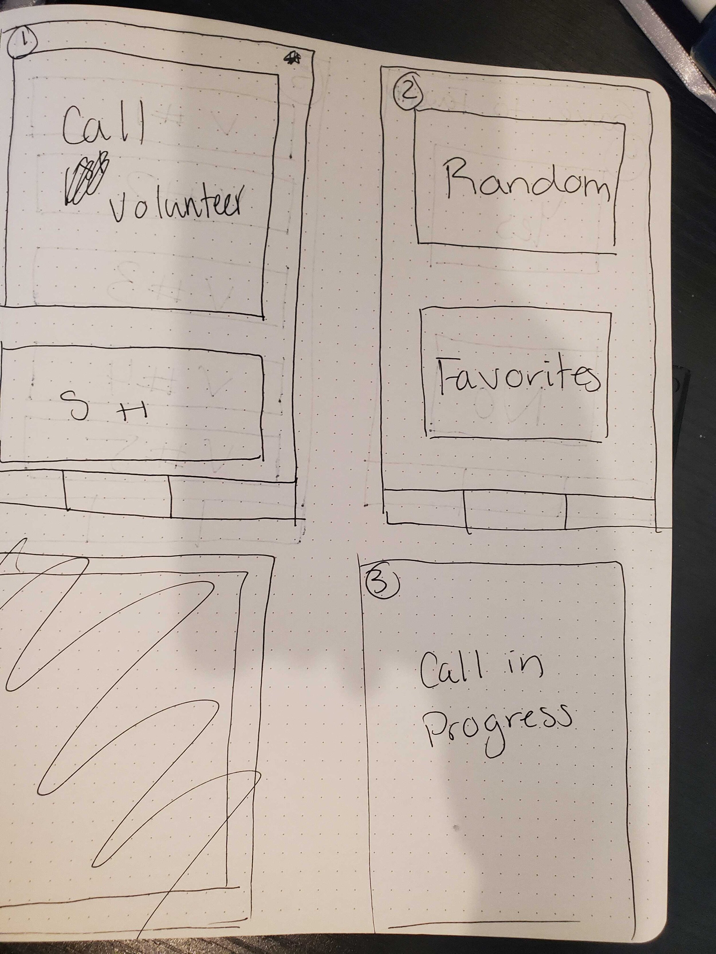
SKETCHES
Design studio and final sketches created as a team.
DELIVER
USABILITY TESTING
We conducted usability testing on 6 participants with 4 goals and 8 tasks. We noted the time it took each participant to finish and how many errors, if applicable, they faced.
92% of the users successfully navigated through the prototype. Some difficulties were faced due to the placement of feedback and call-to-actions.
Goals:
Visually impaired user can successfully navigate through the entire process under 5 minutes - 100%
Visually impaired user can successfully add a volunteer to their preference list with no than 2 errors - No Errors
Volunteer user can successfully navigate through the entire process under 5 minutes - 100%
Volunteer use can successfully set their availability during onboarding with no than 2 errors - No Errors
Tasks:
Make a call as a visually impaired user
End a call as a visually impaired user
Understand all function as a visually impaired user
Add volunteer call to preference list
Go through onboarding as a volunteer
Set availability as a volunteer user
Edit availability as volunteer user
Understand setting availability as volunteer
ITERATIONS
From our usability testing, we were able to make iterations for our final prototype. On the left is our initial prototype and the right is our iterations.

Most of the feedbacks we received for our visually impaired users were about the sizing of the buttons and texts.

We received feedback from the volunteer on the clarity of the buttons and what they meant. As a result, we modified the wording and added messages to help users understand what the buttons meant.
We also changed some small icons that was confusing to some users during the usability test.
PROTOTYPE
Our two prototypes created in Figma: one for the volunteer and one for the visually impaired user.
TAKEAWAYS
This was my first passion project and first group work as a UX designer. It was great learning project and time management. It was also great to do a design studio with my teammates.
Moving forward, I would want to do another round of user interviews to gain insight on more visually impaired users.
I would also want to do a deeper usability testing on the user interface and explore different options on colors and understand how the iOS and Android accessibility features line up with Be My Eyes.
Other UX Design Case Studies